

I stared at my living room wall for three months before doing anything about it. It wasn’t ugly. It was just there. Blank. Beige. The kind of wall that makes you feel like you’re still unpacking even though the last box disappeared six months ago. I didn’t want to paint because my landlord’s lease had that threatening clause about “original condition upon vacating.” I didn’t want framed art because I’ve moved seven times in six years, and patching nail holes has become my least favorite hobby. So I did what any reasonable person does. I ignored it.
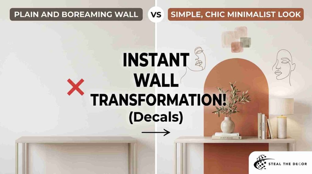
Then I discovered removable wall decals for a minimalist look. Not the cartoonish butterfly stickers my college roommate slapped above her futon. I’m talking about the kind of decals that make guests ask, “Did you hire an interior designer?” The kind that peel off without leaving a trace when your lease ends. The kind that costs less than dinner for two but transforms a room in twenty minutes.
I’ve since tested more than a dozen decals across three apartments. Some I love. One I regret. A few are just fine. This guide covers everything I learned the hard way, so you don’t have to.
Why Removable Wall Decals for a Minimalist Look Actually Work
Most people think minimalism means empty walls. I did too. For years, I kept my apartment stark because I thought blankness equaled discipline. What I actually created was a space that felt unfinished. There’s a difference between intentional negative space and just not trying.
Removable wall decals solve this problem with surgical precision. They add visual weight without physical bulk. No frames casting shadows. No glass reflecting glare. No dust collecting on ledges. Just a thin layer of matte vinyl or woven fabric sitting flush against the paint, doing exactly what it needs to do and nothing more. That’s minimalism in product form.
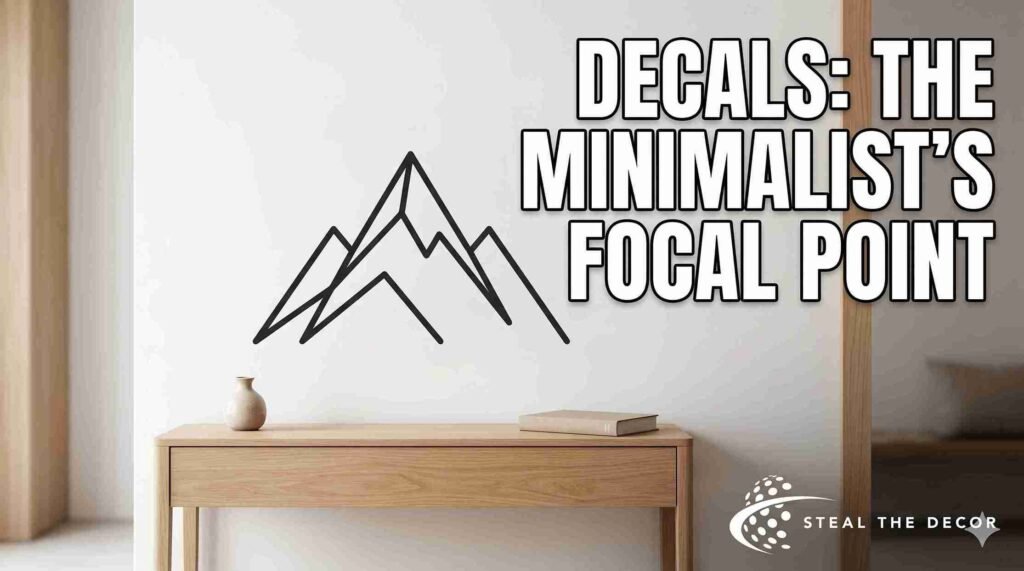
The best minimalist wall stickers don’t announce themselves. They settle into the room as they’ve always been there. A single line drawing above a console table. An earthy arch behind a bed. A cluster of terrazzo flecks near a desk. Each one intentional. Each one earns its place on the wall.
What surprised me most was how much larger my rooms felt after adding decals. I expected the opposite. I assumed anything on the walls would shrink the space. But when you place a geometric line art wall decal in the right spot, it anchors the eye and creates depth. The wall recedes. The room breathes. My therapist didn’t notice, but my friends did. Two of them asked for links after one visit.
The psychology here isn’t complicated. Humans need focal points. A completely bare room feels unsettling because your eyes don’t know where to land. Decals provide that landing strip without the visual noise of gallery walls, shelves, or heavy frames. If you’re after a Scandinavian-style wall decal aesthetic, you’re essentially importing a design philosophy that treats every object as functional art. Even a simple black line on white matte material qualifies.
The Psychology of Negative Space (And the Mistake I Made)
Understanding Visual Breathing Room
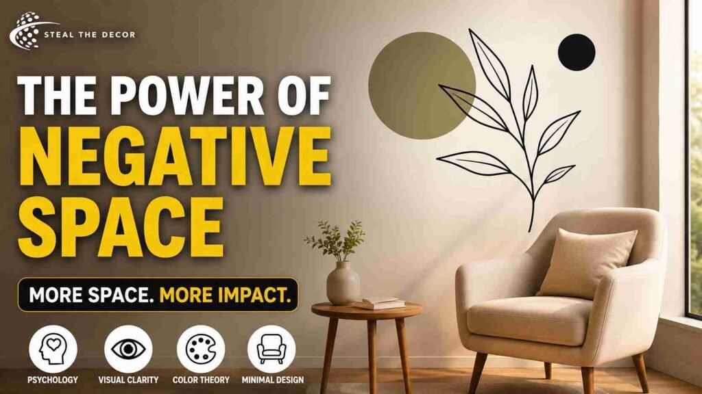
Negative space isn’t emptiness. It’s the pause between notes that makes music listenable. With wall decals, the space around the design matters more than the design itself. I learned this the expensive way.
My first decal purchase was a set of 47 geometric gold dots from Amazon. They came in six sizes, ranging from dime-sized to coaster-sized. I arranged them across an eight-foot wall in my bedroom in what I thought was an artistic scattered pattern. When I stepped back, it looked like someone had thrown confetti at a wedding and walked away. I peeled half of them off the next day. The wall immediately looked better. That’s when I understood: if you’re using abstract shape wall graphics, the space between shapes defines the composition.
Color Theory for Minimalist Decals
I’ve tested three color families across different rooms and lighting conditions. Monochrome, specifically matte black on white walls, photographs beautifully but can feel stark in north-facing rooms. Warm neutrals like terracotta, sand, and taupe soften the atmosphere without adding busyness. They’re ideal for bedrooms where you want calm without coldness. Muted pastels, think sage green, dusty blue, blush, work surprisingly well in bathrooms and nurseries. They register as color without screaming.
One neutral tone wall decal I placed in my hallway looked completely different at 8 a.m. versus 6 p.m. The morning light pulled out yellow undertones. Evening made it almost gray. I didn’t expect that level of variability. If you’re particular about consistency, test a small swatch first or stick to black.
Eliminating Physical vs. Visual Clutter
This distinction changed how I decorate. Physical clutter is the pile of mail on your counter. Visual clutter is the gallery wall with seventeen frames in mismatched finishes. Decals eliminate both simultaneously. They add design without adding objects. A clean lines interior design hack that actually works.
I used to think I needed shelves, plants, and art to make a room feel finished. Turns out I needed one well-placed fine line art wall sticker above my desk and literally nothing else on that wall. The room finally felt complete. Not crowded. Complete.
Material Breakdown: Vinyl vs. Fabric vs. What Actually Lasts
Vinyl Decals: The Budget Workhorse
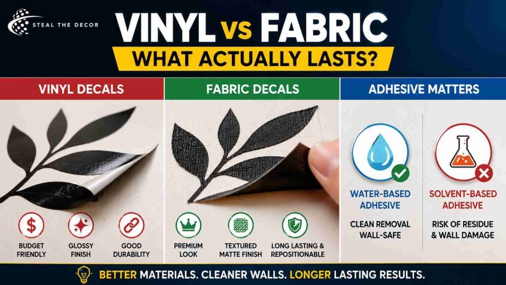
Standard vinyl is what most people picture when they hear “wall decal.” It’s thin, slightly glossy by default, and costs between $12 and $40 depending on size. I’ve used vinyl decals in three apartments. They work. They stick. They peel off cleanly if you’re patient during removal.
The downside is that cheap vinyl looks cheap. You can spot an $8 Amazon decal from across the room because the edges catch light and the surface has that telltale plastic sheen. If you’re going with vinyl, spend the extra $10 to get matte finish removable wall decals. The difference is dramatic. Matte vinyl absorbs light instead of reflecting it, so the design integrates with the wall rather than sitting on top of it.
Fabric and Woven Decals: The Premium Choice
I discovered woven polyester decals accidentally. I ordered what I thought was a standard vinyl arch from a brand called RoomMates, and what arrived was this thick, fabric-like material with a texture similar to luxury wallpaper. It felt substantial. It looked expensive. It was premium fabric wall decals vs vinyl in practice, not just marketing.
The installation took slightly longer because the material is thicker and requires more smoothing. But the result was worth it. Zero glare under my ring light. Zero peeling at the corners after six months. The matte texture mimics high-end wallpaper at a fraction of the cost. If someone touches the wall, they feel the texture instead of plastic. That tactile difference matters more than I expected.
Fabric decals also reposition more forgivingly. I placed my arch about two inches too far left on the first attempt. With vinyl, that would’ve meant stretching or tearing. With the woven material, I peeled it back slowly and realigned without any damage. This is the category I recommend for anyone using the removable wall graphics heat removal method later, because fabric responds better to gentle warming during removal.
Water-Based vs. Solvent-Based Adhesive
This sounds technical, but it matters enormously for renters. Water-based acrylic adhesive, which most reputable brands now use, bonds to paint without chemically fusing to it. Solvent-based adhesives, common in cheaper imported decals, can react with wall paint and leave a sticky residue or, worse, pull paint off entirely.
I tested this painfully. A $14 set of floral decals from a no-name brand left a gummy film on my bathroom wall that required Goo Gone and thirty minutes of scrubbing. The water-based alternatives I’ve used since then have peeled off cleanly every single time. If the product listing doesn’t specify “water-based adhesive,” assume the worst. This is especially critical if you’re searching for apartment-safe wall art and your deposit is on the line.
Matte vs. Gloss: Why Finish Matters More Than Design
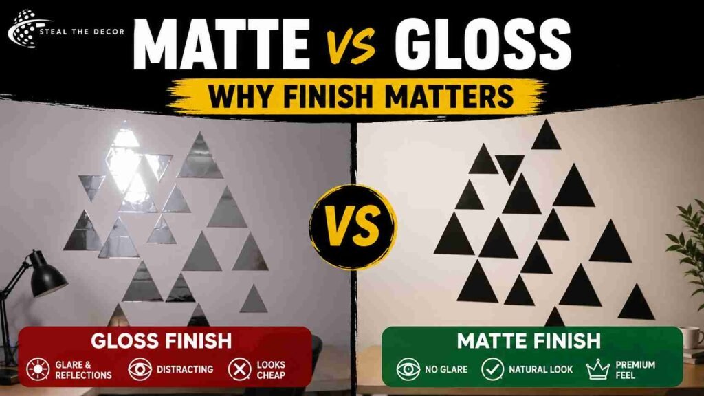
This section exists because I made a gloss mistake, so you don’t have to. My first decal purchase was a glossy white geometric pattern for my home office. In the product photos, it looked sophisticated. On my wall, under the overhead light I use for video calls, it looked like a laminated placemat. The glare created hotspots that distracted from everything I said on camera.
Matte woven wall stickers solve this completely. Matte finishes absorb light rather than bouncing it. The design reads as part of the wall surface, not an object attached to it. For minimalist aesthetics specifically, gloss undermines the entire look. Minimalism thrives on subtlety. Glossy decals announce themselves. Matte ones whisper.
There is exactly one scenario where gloss works: black decals on black walls in very low light. That’s it. For every other application, especially if you’re using peel-and-stick minimalist wall art in rooms with natural light, choose matte. I’ve never once regretted a matte purchase. I’ve regretted every glossy one.
7 Removable Wall Decals for a Minimalist Look Worth Buying
Category 1: Abstract Fine Line Art and Face Silhouettes
This is the category that gets the most compliments in my apartment. Single-line drawings of faces, bodies, or abstract forms drawn in one continuous stroke. The aesthetic sits somewhere between a Parisian art studio and Scandinavian functionalism. I have a black and white minimalist wall decal of a woman’s profile above my dresser, and it’s the first thing people notice when they walk in.
These work best in small to medium sizes. Too large, and the line weight looks disproportionate. Too small, and the detail gets lost. I’d recommend 18 to 24 inches as the sweet spot. Placement matters: they need breathing room on all sides. Don’t flank them with other decor. Let the line speak for itself.
Category 2: Giant Earthy Arches and Faux Headboards
Arches are having a moment in interior design, and decals make them accessible without construction. A terracotta or muted clay arch placed behind a bed frame creates the illusion of a headboard. Behind a console table, it defines the entryway. I picked up the RoomMates Terracotta Arch Decal for $29.99 on Amazon, and it became the backdrop for every Zoom call I took last fall. The color reads warm without being aggressive, and the matte finish photographs beautifully.
One caveat: arches need precise placement. If the arch is even slightly off-center relative to your furniture, the whole room feels crooked. I used a laser level after my first attempt ended up listing to the left like a sinking ship. The earthy arch wall decals trend is worth following, but only if you measure twice.
Category 3: Delicate Botanical and Meadow Grass Silhouettes
I was skeptical about botanical decals. They sounded like something from a yoga studio waiting room. But the biophilic minimalist wall art trend won me over. Soft eucalyptus stems, thin palm fronds, and wispy pampas grass silhouettes in muted sage or dusty olive add life without clutter. I placed a set of three eucalyptus sprigs in my bathroom, and it transformed a room that previously felt like a generic hotel into something that felt intentional.
The key is choosing designs with thin, delicate lines. Thick, heavy botanical shapes read as craft store decor. Light, airy silhouettes read as design. This is also where boho minimalist wall stickers overlap with minimalist principles, sharing a love of organic forms without excess.
Category 4: Scandinavian Geometric Shapes and Terrazzo Flecks
Geometric decals are the easiest to mess up and the most rewarding when done right. Triangles, half-circles, and terrazzo-style micro-dots arranged in asymmetrical clusters. These work especially well in home offices and creative spaces where you want energy without chaos.
I used a set of Scandinavian-style wall decals in muted navy and ochre near my desk. The shapes are small, about two inches each, scattered across a three-foot area. From a distance, they read as texture. Up close, they’re playful. The geometric line art wall decals category is broad, so narrow your search by finish and color palette before buying.
Category 5: Typography and Elegant Monoline Quotes
I have complicated feelings about word decals. Most of them belong in a 2012 Pinterest board titled “Live Laugh Love.” But there’s a subset of typography decals that work beautifully. Single words in ultra-thin sans-serif or hairline serif fonts. Words like “Reset,” “Breathe,” or simply “Home.” No exclamation points. No cursive. No inspirational paragraphs.
I placed a small “Begin” decal near my coffee station. It’s three inches wide. You barely notice it unless you’re standing right there. That restraint is what makes it work. If you’re considering typography wall decals, ask yourself: would this word still feel right six months from now? If there’s any hesitation, skip it.
Category 6: Subtle Watercolor and Color Block Forms
Watercolor decals sit in an odd middle ground. The good ones look like an actual painting bled onto your wall. The bad ones look like a printer running low on ink. I’ve owned both. The difference comes down to print resolution and material quality. Fabric decals render watercolor gradients more convincingly than vinyl because the matte surface diffuses the ink in a way that mimics paper.
Overlapping asymmetrical shapes in earth tones, terracotta, rust, ochre, and charcoal create depth without pattern. This is where modern organic wall decor lives. Not quite geometric, not quite botanical, just shapes in conversation with each other.
Category 7: Faux Architectural Elements
Decals that mimic wall molding, wainscoting, or paneling. These are clever in theory. In photos, they look remarkably convincing. In person, under side lighting, the illusion breaks because the decal casts no actual shadow. Your eye knows something is off even if your brain can’t name it.
I tried a set of faux paneling decals in my hallway. They looked fantastic in flat, diffused light. At sunset, when light streamed in from the side window, they revealed themselves as stickers. Not badly. But enough that I noticed. I kept them up because they were fine. Just fine. Not life-changing. Not terrible. That’s the “meh” category I promised you.
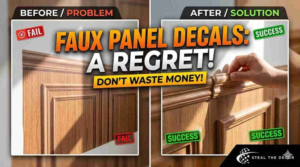
The One Decal Style I Wouldn’t Buy Again
Full transparency: I regret my faux architectural decals. Not because they were ugly, they weren’t. But because they cost $47 and deliver roughly the same impact as a $12 geometric set. The problem is structural. Decals that pretend to be three-dimensional objects always lose the battle against real lighting conditions. A flat sticker cannot replicate the depth of actual molding, and your brain notices the absence even if you can’t articulate why.
If you love the paneling look, save up for the real thing or use renter-friendly peel-and-stick trim kits, which are thicker and create actual shadow lines. Decals should lean into their flatness, not fight it. This is my honest take after living with them for four months. I didn’t return them. I don’t hate them. But I wouldn’t spend the money again.
Room-by-Room Styling: Where to Place What
The Minimalist Living Room
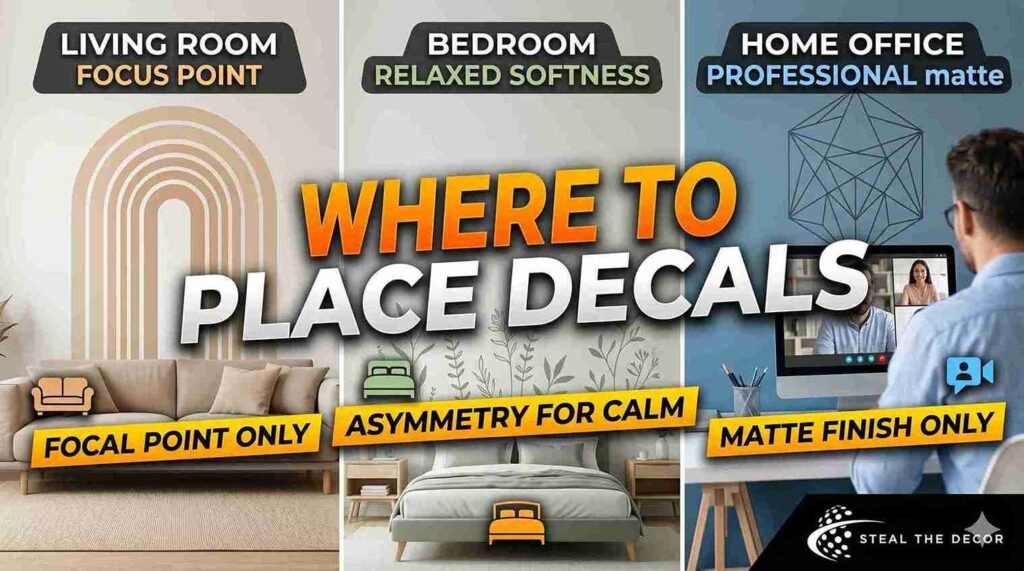
The living room is where most people overdo it. I did. My first attempt involved decals on three walls because I thought each one needed “something.” What it actually needed was one focal point. I kept a large minimalist living room wall decal, an abstract arch in warm beige, above my low-profile sofa. I removed everything else. The room immediately felt twice as large and ten times more intentional.
The focal point strategy works because living rooms already have visual weight from furniture. Your sofa, coffee table, and media console are doing heavy lifting. The wall decal’s job is to anchor the seating area, not compete with it. Place your decal at eye level, centered above the largest piece of furniture. Leave the other walls alone. If you’re using damage-free wall stickers for apartments, this approach also minimizes the number of decals you need to remove later.
The Serene Bedroom
Bedrooms benefit from softness. I placed a set of serene bedroom wall stickers, thin botanical silhouettes in sage green, behind my nightstands rather than above the bed. This was a deliberate choice. Above-the-bed decals create symmetry that can feel formal. Beside-the-bed decals create asymmetry that feels relaxed. Both work. I prefer the latter.
If you’re using a faux headboard wall decal, center it behind the bed and make sure it extends at least six inches beyond the mattress width on both sides. A headboard decal that’s narrower than your bed looks like a mistake. Scale matters more here than in any other room.
The Productive Home Office
Video calls changed everything about home office decor. What looks good in person might look terrible on camera, and vice versa. I learned this when a glossy decal behind my desk created a glare that made my face look underexposed on every call.
Modern home office background decals need three qualities: matte finish, simple shapes, and placement at camera-visible height. I use a single geometric line art piece, roughly 20 inches wide, visible over my right shoulder. It reads as professional without being distracting. Avoid busy patterns behind your head. Avoid glossy finishes entirely. If your job involves frequent video calls, treat your wall decal as part of your professional presentation.
The Gender-Neutral Minimalist Nursery
I don’t have kids, but I’ve helped two friends set up nurseries in rentals. The mistake everyone makes is going too thematic. Jungle animals. Princess castles. Cartoon characters that the child will outgrow in eighteen months. Gender-neutral minimalist nursery decals take the opposite approach. Soft shapes, muted colors, designs that grow with the child.
We used small cloud and star silhouettes in warm gray for one nursery. For another, simple line-drawn mountains across one wall. Both rooms felt calm rather than chaotic. Both parents reported that their babies actually seemed less overstimulated compared to busier rooms. That’s anecdotal, but it tracks with what we know about infant visual processing. Simple shapes. High contrast. Clean lines.
Rental-Proof Application: The Step-by-Step Zero-Bubble Method
Pre-Application Wall Assessment
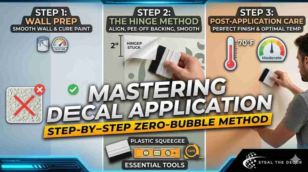
Before you peel a single backing, check your wall texture. Smooth drywall with eggshell or satin paint is ideal. Knockdown texture, the kind that looks like dried orange peel, is workable but trickier. Heavy popcorn texture is a no-go. Decals won’t adhere properly to deep texture, and you’ll end up with air gaps and peeling edges.
The bigger issue is paint curing time. If your apartment was painted right before you moved in, wait at least four weeks before applying any decals. Fresh paint continues curing and off-gassing for up to 30 days. Applying a decal too early traps moisture and can cause bubbling or, worse, adhesive bonding that tears paint upon removal. I tested this timeline in my current apartment. Four weeks of patience saved me from what could have been an expensive wall repair.
The Hinge Method
This is the technique that changed my decal application from “good enough” to “looks professional.” Instead of peeling the entire backing and trying to position a sticky sheet against the wall, you peel only the top two inches, align and stick that portion, then slowly peel the backing downward while smoothing with a squeegee or credit card.
Tools you’ll actually need: a laser level or standard bubble level, painter’s tape for test placement, and a plastic squeegee, which usually comes free with higher-end decals. I bought a $6 application kit on Amazon after ruining a decal with a credit card that had a sharp edge. The squeegee has a felt-covered edge that won’t scratch the material. Worth every cent.
The method works equally well for easy-to-remove wall graphics because proper initial application means easier eventual removal. Air bubbles trapped during installation create weak points where the decal might tear later. Taking an extra ten minutes during the application saves an hour of frustration later.
Temperature and Humidity
Decals behave differently in different conditions. Cold walls make adhesive stiff and less tacky. Humid bathrooms make decals prone to slipping during application. I apply decals in rooms between 65°F and 75°F with moderate humidity. If you’re decorating a bathroom, run the exhaust fan for an hour before starting to reduce moisture. This is especially relevant for wall decals for smooth surfaces in bathrooms, where even minor humidity can complicate adhesion.
Removal Without Regret: The Hairdryer Trick I Actually Use
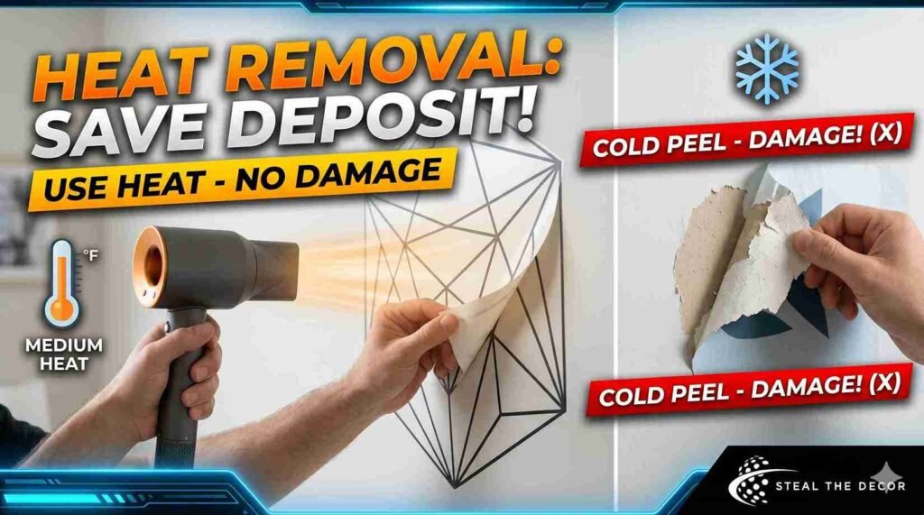
Removal anxiety is real when you’ve paid a security deposit. I’ve removed decals from three apartments now, and only one removal caused damage. Guess which one? The one where I rushed and didn’t use heat.
The removable wall graphics heat removal method is straightforward. Set a hairdryer to medium heat, not high, hold it about six inches from the decal surface, and warm one corner for about thirty seconds. The heat softens the water-based adhesive so it releases from the paint rather than pulling it. Gently lift that corner with your fingernail or a plastic scraper. Once you have a grip, continue warming the seam where the decal meets the wall as you slowly peel downward.
Do not yank. Do not peel cold. I yanked a cold decal off my first apartment wall and took a two-inch paint chip with it. My landlord deducted $80 from my deposit for that patch job. Learn from my impatience.
For woven fabric decals, this process is even easier because the material is more durable and less likely to tear during removal. Most no-residue peel-and-stick decals from reputable brands use adhesives specifically designed for clean release. The keyword is reputable. Check reviews before buying. Look specifically for reviews that mention removal experience, not just application.
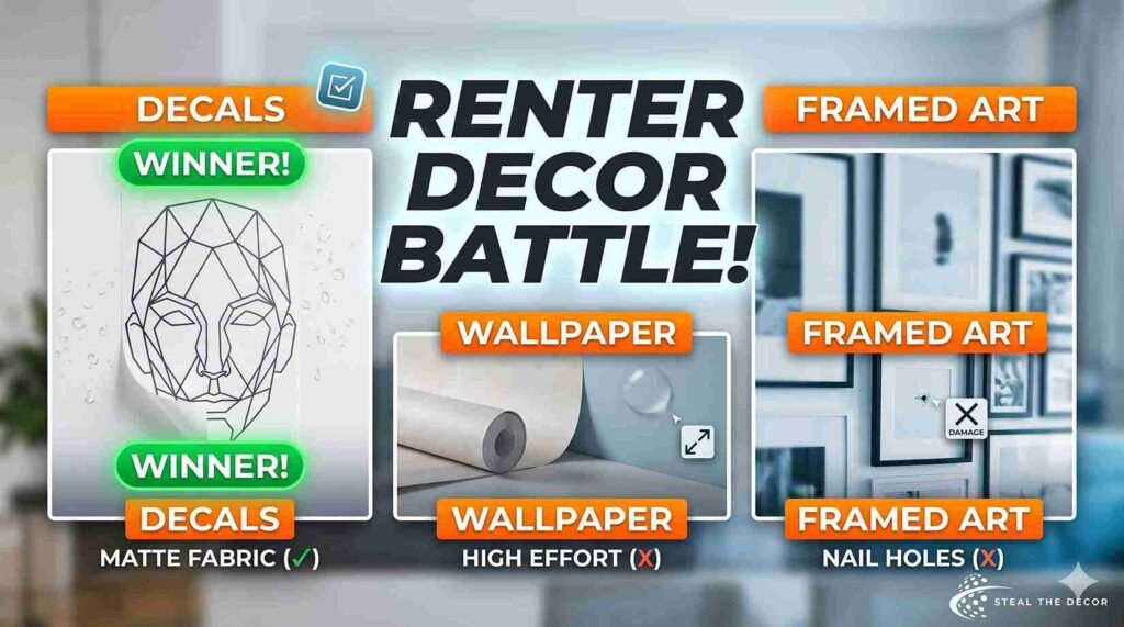
Decals vs. Wallpaper vs. Framed Art: Honest Comparison
| Factor | Removable Wall Decals | Peel-and-Stick Wallpaper | Framed Art |
| Average Cost | $12–$50 per piece | $30–$80 per roll | $25–$200+ per frame |
| Installation Time | 15–30 minutes | 2–4 hours per wall | 30 minutes (with tools) |
| Damage Risk | Very low (water-based adhesive) | Low to moderate | High (nail/screw holes) |
| Reusability | Moderate (fabric decals best) | Low (stretches during removal) | High (but leaves holes) |
| Aesthetic Flexibility | High (swap seasonally) | Medium (committed look) | High (swap anytime) |
| Renter-Friendliness | Excellent | Good | Poor |
| Shadow/Depth Effect | None (flush to wall) | None (flush to wall) | Strong (glass, frame depth) |
My honest take: if you move frequently or hesitate before committing to decor decisions, temporary wall decals for renters are the clear winner. Wallpaper requires more effort and creates more waste. Framed art requires wall damage and significant investment for quality pieces. Decals sit in the sweet spot: affordable, removable, and surprisingly sophisticated when you choose matte fabric over glossy vinyl.

Troubleshooting: Mistakes That Can Ruin Your Wall
Overcrowding the Wall
The most common mistake I see, and made myself, is treating a wall like a canvas that needs filling. Minimalism works because of what’s not there. If you’re placing decals, step back frequently during arrangement. If the wall feels “busy” even for a second, remove one element. Busyness doesn’t age well. You’ll get tired of it within weeks.
Buying Cheap Glossy Decals
I’ve said this already, but it bears repeating in a troubleshooting section because it’s the mistake with the highest regret-to-cost ratio. A $9 glossy geometric set from a no-name Amazon seller will almost certainly disappoint you. Spend $20 to $35 on matte finish removable wall decals from brands with real reviews and clear product photography. The price difference is two cups of coffee. The satisfaction difference is months of enjoying your wall versus months of tolerating it.
Ignoring Wall Texture
Textured walls are the enemy of adhesion. If you have orange-peel or knockdown texture, test a small decal in an inconspicuous spot before committing to a large piece. Some premium fabric wall decals handle light texture better than vinyl because the thicker material bridges small gaps. But no decal performs well on heavy texture. If your walls feel like sandpaper to the touch, decals probably aren’t your solution.
Applying to Fresh Paint
I mentioned the four-week rule earlier, but I’m restating it here because it’s the mistake that actually costs money. Fresh paint and adhesive can bond permanently if applied too soon. The result is a decal that either won’t come off cleanly or takes paint with it. This is how you lose security deposits. This is how you develop trust issues with wall decor. Just wait a month.
Frequently Asked Questions
Do removable decals work on textured walls?
They can, but results depend on texture depth. Light orange-peel or knockdown texture usually works with thicker fabric decals because the material bridges small surface variations. Heavy popcorn texture or rough stucco will prevent proper adhesion. I tested a small fabric decal on my knockdown-textured hallway, and it held fine for six months before I removed it. If you’re unsure, buy the smallest available size first and test in a hidden spot.
How long do high-quality vinyl decals last?
Expect two to five years from premium vinyl decals under normal indoor conditions. Direct sunlight shortens lifespan by degrading adhesive and fading ink. My office decal, which gets afternoon sun, started showing faint edge lift after about eighteen months. The decals in my windowless hallway looked brand new after two years. Fabric decals tend to outlast vinyl because the material resists environmental stress better.
Can you reuse a wall decal after peeling it off?
Sometimes yes, sometimes no. Woven fabric decals are designed for repositioning and can often be reused if removed carefully and stored with the original backing paper. Vinyl decals stretch during removal, which distorts the shape and weakens the adhesive. I successfully reused one fabric arch decal in a second apartment. I’ve never successfully reused a vinyl one. If reusability matters to you, choose fabric.
Will wall stickers cause mold or trap moisture?
In normal indoor conditions, no. Decals with water-based adhesive allow the wall to breathe minimally. However, applying decals in bathrooms with poor ventilation or on walls with existing moisture problems can trap humidity and encourage mold growth behind the decal. Always run your bathroom exhaust fan regularly, and never apply decals to damp walls. I’ve used simple kitchen wall decals and bathroom decals without mold issues, but my apartment has good ventilation.
How do you clean dust off a matte fabric wall decal?
Use a dry microfiber cloth and very light pressure. Dust settles on fabric decals more than vinyl because the matte texture provides slightly more grip for particles. I dust mine once a month with a Swiffer duster or a clean microfiber cloth. Avoid water, cleaning sprays, or wet cloths, which can seep into the fabric weave and weaken the adhesive. If something sticky lands on the decal, use a barely-damp cloth on just that spot and dry immediately.
Final Thoughts on Removable Wall Decals for a Minimalist Look
I started with a blank beige wall and a vague idea that minimalism meant having nothing. What I learned, after dozens of decals, several mistakes, and one paint chip that cost me $80, is that minimalism means having exactly enough. For some walls, that’s one line drawing. For others, it’s a terracotta arch that makes your Zoom background look intentional. For a few, it’s nothing at all.
Rental-friendly wall decor hacks don’t require compromising on aesthetics. The best removable wall decals for a minimalist look are matte, made of fabric or premium vinyl, installed with patience, and removed with a hairdryer and humility. They cost less than a nice dinner and last long enough to justify the expense twice over.
I’d love to hear about your experience. Have you tried removable decals in your apartment? Did you make a placement mistake that still haunts you, or did you nail it on the first try? Drop a comment or send me a photo of your setup. I’m always looking for new ideas, preferably ones that don’t involve patching drywall.
About the Author
I’m Mira. I’ve moved seven times in six years, which means I’ve patched more nail holes than I can count and developed very strong opinions about removable wall decor. I own three identical glass mugs because I’m convinced each new one will somehow improve my morning coffee. The first one was fine. I still bought two more.